Saturday, September 19, 2009

Candy Shoppe Sweet 16 Blog Hop Challenge

Candy Shoppe blog is hosting a super fun blog hop challenge in honor of their birthday. There are 10 blogs with instructions on each one and in the end you end up with a unique layout. Plus, the participants have a chance to win a sweet kit from Studio Calico, more details on Candy Shoppe Blog. I had a blast playing!!! Thanks, gals, for setting this up.

Promotion for the Candy Shoppe Sweet 16 Blog Hop
Here's a summary of the steps:

1) Choose a unique background. I was walking around my room looking for what would work when I came across this 12x12 cork I had leftover from a self made bullatain board. It was just the right size too so I couldn't pass it up. The only downside is that it won't fit into a page protector, but it was definitely unique compared to my traditional backgrounds.
2) Add an paper with an edge.
3) Add patterned paper on top.
4) Choose a closeup photo. I didn't have many options here because I was running low on photos and this one was a few of the closeups.
5) Do something to the side of the photo. I punched mine.
6) Layer the photo over the DP.
7) Add ribbon. On my page I have a ribbon seperating the two DPs and twine wrapped aroudn the lower part of the page.
8) Put at least 3 flowers into a corner of the photo. Did that.
9) Add at least 3 other kinds of embelishments. I added a paper tag that said "Smile", a fabric tag that says "Live with passion", a chipboard bracket and cut out branches from the remainder of my DP to tie in the earthy feel.
10)Add a title. My title was "Outside the Box" because this whole layout was kind of unusual for me, the layout was about me and in some aspects my life is kind of unique and finally because the page was about nothing in particular and I needed a generic title (there, I gave it away). The word "outside" is put together using Heidi Swapp clear alphabet where I outlined the edges with chocolate ink to make it more visible. The word "box" was a self made embelishment of a sort. I took some pop caps, smashed them, added DP with alphabet stickers and then covered the whole thing with Crystal Effects. I had to let it dry overnight but now it's hard and shiny. 


Scrapbook layout on a cork background for a blog hop challenge. The layout is using earthy tones, clear Heidi Swapp alphabet and handmade pop cap embelishments.


Hmm, since this doesn't fit into my album now i need to find a place on the wall to put this up. It's finally Friday, I'm so happy the weekend is here. Hope yours is a good one.

Closeup of a scrapbook layout on a cork background for a blog hop challenge. The layout is using earthy tones, clear Heidi Swapp alphabet and handmade pop cap embelishments.

Supplies :
  • Paper: Cork board, SIE Tarragon from Dill Blossom collection, Colorbok DP form a chipboard set
  • Ink: Chocolate chip, Sharpie
  • Accessories: Ribbon, twine, Heidi Swapp chipboard, tag and clear alphabet, Prima flowers, Stampin'Up! pearls, fabric tag ( I think it's from Around the Block), pop caps, Around the Block alphabet , Crystal Effects
  • Tools: Stampin'Up! punch

~Olga

Wednesday, September 16, 2009

Rain

After 2 months of 100+ degree weather and drought, it started raining in Austin last weekend. It's been raining for several days, which is great for my lawn, but I'm already missing the sunshine. It was a lazy, gloomy Saturday morning this weekend so I made pancakes, I think for the 2nd time in my life (I'm not kidding), but they turned out delicious. I just had to take a picture.

Pancakes with strawberries
Then, somewhere between painting my fireplace wall and cleaning up the guest room I would sneak back to my craft room (ahhh, did I mention how much I love my new craft room?) to work on a few pages. This one is my latest favorites.

12x12 scrapbook layout with the dog wanting to play in the snow; the layout features BasicGrey papers and uses stitching, layering and stamping

The picture is of my parents' dog, Alice. She loves the outdoors (especially in the winter) and always gives the same questioning head tilt asking "You want me to go back inside? Are you sure? I'd much rather sit here instead," when called to come back indoors. The layout is 12x12 based on this adorable Pencillines sketch . I used primarily Basic Grey papers, stitched the sides and under the title, layered, sponged the edges of the papr, added beads (icicles), ribbon and twill, layered some more, stamped in irodescent ice on the title and snowflakes and cut the smaller part of the title on my Wishblade. 


Closeup of the scrapbook page featuring BasicGrey Dasher and Figgy Pudding papers and uses stitching, layering and stamping; title is chipboard stamped with snowflake images and ribbon tied around it.
Supplies (All supplies are Stampin'Up! unless otherwise noted) :
  • Stamps: Snow Flurries
  • Paper: Figgy Pudding and Dasher collection by BasicGrey
  • Ink: Chocolate chip, soft sky, Versamark, iridescent ice embossing powder
  • Accessories:  Beads from Pretties Kit, plastic winter Holidayhouse and Metalgrams by American Crafts, Heidi Swapp alphabet, ribbon, twill
  • Tools: Sewing machine, Cuttlebug
The second layout was from last week for a submission to Back Porch Memories. I was hanging a copy of the "Apparition of the Face of Aphrodite" painting by Dali in the library and the colors and papers I chose were loosely based on the painting with a somewhat modern, contemporary feel.
12x12 modern scrapbook layout for a sketch challenge using Periphery collection by Basic Grey

Supplies (All supplies are Stampin'Up! unless otherwise noted) :
  • Stamps: Note It by Inque Boutique
  • Paper: Pinot Noir, Merlot from Periphery collection and Recess from Basic Grey, yellow Bazzil
  • Ink: Basic black, bordering blue, chocolate chip
  • Accessories: making memories eyelets, chocolate chip ribbon, Prima flowers, swirl clip from Hodgepodge Hardware, stickers by Kelly Paracci
No cards for today because the pages took most of the time, but stay tuned later in the week.

    ~Olgy

    Saturday, September 12, 2009

    Catching Up on Scrapbooking

    Now that we're at least somewhat moved into the new house, I've had more time to scrapbook again. I've been on a roll since Sunday managing a layout a day! Now updating my blog with the pictures, that's another story...

    Scrapbook layout on Stampin'Up! blue bayou paper using embossing cracked glass technique
    The first picture is of my DH and I at a restaurant last year right after I finished my first tri (that's why my face is so sun-burned). For the title/main embellishment i was playing around with the cracked glass technique and it turned out pretty well. For this technique all you need to do is cover the image with Versamark, generously sprinkle on thick clear embossing powder, heat with the heat gun (just like for regular embossing) and when the powder melts and dries hard then bend the image to crack the top layer. I used the negative part of the cutout of DP as a frame around my journaling and added other embelishments such as vellum and metal tags. For the ribbon stitching at the bottom of the page, I first punched out the holes with small circle punch and finished it off with a bow and a brad from "make-a-brad" kit from Stampin'Up! where I used the same coordinating DP.

    Scrapbook layout on Stampin'Up! blue bayou paper using embossing cracked glass technique closeup

    Supplies (All supplies are Stampin'Up! unless otherwise noted):
    • Stamps: Pretty Amazing, Fabulous Flowers
    • Paper: Blue bayou, vellum, Cherished Flowers by My Mind's Eye
    • Ink:Basic black, blue bayou, old paper distress ink, Versamark and embossing powder
    • Accessories: Heidi Swapp ribbon, Puzzle words by Karen Foster, tag by Making Memories, rub-on, make-a-brad
    • Tools: Topz Notes die, punch

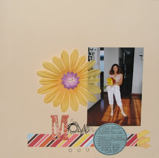
    For the next page, I followed a Candy Shoppe blog first design challenge, striptease-101. The challenge was to create a layout with paper strip elements using cream, pink, yellow, blue and purple and as a bonus to use a sketch. I liked the sketch and followed all of the above. My strip of paper also had color stripes on it, so it served double duty.

    Scrapbook layout following candy shoppe challenge to use strips of paper and colors. The page has white space and flowers.

    Supplies (All supplies are Stampin'Up! unless otherwise noted):
    • Stamps: Journaling stamp by Katie Pertier
    • Paper: SEI beige from Dill Blossom collection, striped paper from American Crafts, Baja Breeze
    • Ink: Basic black
    • Accessories: Heidi Swapp flower, purple flower (can't recall manufacturer), Kology chipboard by K&Company, pearls, ribbon and rub-ons by Basic Grey

    ~Olgy

    Tuesday, September 8, 2009

    Show Me Some Bling

    I'm not a pink and hearts type of girl, but when I saw SEI Chocolat collection last year I couldn't resist. I brought it home and made a few cards right away. They were so quick because the paper was beautiful all on it's own. I made a few variations with different embelishments around the ribbon as well as the sentiment.

    Handmade card using SEI Chocolat designer paper and Stampin'Up! It's about time stamp set
    Supplies (All supplies are Stampin'Up! unless otherwise noted) :
    • Stamps: It's about time
    • Paper: eclair and cherie by SEI
    • Ink: Versamark and white embossing powder
    • Accessories: Butterfly embellishment from SEI chocolat collection

    Fast forward to now, I found the stack still almost full sitting in my DP stash. It was time to make some layouts. I've been digging through some really old photos lately, uploading a few of them on Facebook for my friends to see and the High School memories started flooding in. Well, what's a better occasion to use some glittery, pink paper than a HS dance?

    12x12 scrapbook layout of High School prom using SEI chocolat collection, Prima flowers and other embelishments
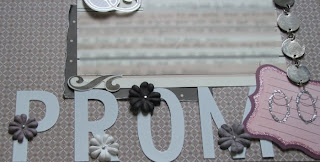
    I used the nougat DP for my base and cut out some flourishes and hearts from mon coeur. For the title, I only had "R" and "O" in the stash, luckily, these metal letters were easy to bend so I broke off a piece to make the "P" and "M" from two "N"s. The flourishes and the picture are poped up with foam squares for extra layers.

    12x12 scrapbook layout of High School prom using SEI chocolat collection, close up on the swirl12x12 scrapbook layout of High School prom using SEI chocolat collection, close up on the title
    Supplies:
    • Stamps: Doodle Script Alphabet by Inque boutique
    • Paper: nougat and mon coeur by SEI, Tender love and care by EK Success
    • Accessories: Prima flowers, rhinestones, Metalgrams by American crafts, glitter die cuts by SEI, metal accent (not arts related)
    While at it, I also made a few quick cards for the CAS bling challenge. For these I used the eclair shimmery paper, matted it with black to contrast my background and embossed the sentiment in silver. Below are the two variations with Primas and pearls.


    Supplies (All supplies are Stampin'Up! unless otherwise noted) :
    • Stamps: Heidi Grace
    • Paper: eclair by SIE, basic black, white Bazzil
    • Ink: versamark and silver EP
    • Accessories: Prima flowers, pearls, brads

    ~Olgy

    Monday, September 7, 2009

    A Card Theif?

    Since it was a three day weekend I've been stamping my little heart out. I distinctly remember making 4 cards for CAS challenges and leaving them on my desk ready to be photographed this morning except today one of them went mysteriously missing. I checked the floor, looked through my scraps, through my trash (twice), cleaned up my entire desk and nearly turned my entire craft room upside down looking for this card, but no success. I know I made it, I even have evidence on my scratch paper and scraps, but the card vanished. I'm staring to think that someone sneaked into the house just to steal this one card.... That just seems like the only logical explanation :) Oh well, I guess I'll only post the others until I catch the "thief".

    The first card is for inspiration challenge and I used this Anthropologie shoe for my vision. I knew what I wanted to do, but struggled a bit getting it on paper because I didn't have wide red ribbon for the center of the card (aha, another excuse to go shopping). The background is stamped with twill to look like tweed on the pumps. I settled for a thinner, darker ribbon with the same bow. The flowers were stamped in black, but to give the image a little more dimension, I traced it with the white pen. Here's my CAS (clean and simple) Seeing Red card.

    Handmade card for SCS CAS, clean and simple, challenge. The card is primarily red and uses Stampin'Up! Happy Harmony stamp as a center image

    Supplies (All supplies are Stampin'Up! unless otherwise noted) :
    • Stamps: Happy Harmony, Warm Words, Twill background
    • Paper: Ruby red
    • Ink:Basic black, white gel pen, Versamark
    • Accessories: Ribbon (Hobby Lobby)
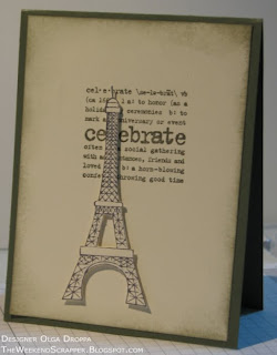
    This next card was for a CAS masculine card challenge. I have to be honest, I'm not very good at making masculine cards, primarily because I don't have many stamps or papers that suit this genre. Luckily, my new Eiffel Tower stamp didn't have flowers or birds or swirls or anything of that kind on it, so it fit the bill. Plus, I can't help but reach for the new toys first. Now for the second part the challenge, the card had to be clean and simple which meant I couldn't layer on the embellishments. Instead, I found this retired Stampin'Up! Lexicon of Love set, which I haven't used in years, stamped it on the background, cut out the Eiffel Tower and popped it up with 3D dots (sorry if it's hard to see that from the photo) and sponged the edges. All in all it took longer to find the stamps then to make the card.  

    Stamped masculine card for SCS clean and simple challenge using the Stampabilities Eiffel Tower stamp

    Supplies (All supplies are Stampin'Up! unless otherwise noted) :
    • Stamps: Eiffel Tower by Stampabilities, Lexicon of Love
    • Paper: Always artichoke, very vanilla
    • Ink: Going grey, always artichoke
    • Accessories: Dimentionals

    ~Olgy

    Sunday, September 6, 2009

    Labor Day

    Happy Labor Day weekend! I've got some house projects planned, but in between I'm taking advantage of extra time off and am catching up on stamping. It was very unlike me, but I woke up early this morning and had a chance to participate in the Featured Stamper SCS Challenge before going back to tiling the fireplace. I needed a baby card, so this is the first one I did, however, since tomorrow is a day off I'm hoping to fit in a few more cards before the weekend is gone.


    Handmade pink baby girl card using Stampin'Up! Bundle of Joy stamp set for SCS Featured Stamper challenge.

    For this card I used some leftover polka dot paper from SU stack. I seem to always reach for this retired Bundle of Joy set for the baby cards. I stameped the bear in pink, filled in the inside with glue being careful not to over the eyes and nose and covered with glitter. Unfortunately, the pink image blended in with the pink glitter a little too much, so I went back and traced it with creamy caramel. Some ribbon and buttons to complete the card so now I'm off to do more tiling.

    Supplies (All supplies are Stampin'Up! unless otherwise noted) :
    • Stamps: Bundle of Joy, Warm Words
    • Paper: Whisper white, DP stack, non-SU textured paper
    • Ink: Pretty in pink, creamy caramel
    • Accessories: Ribbon (Hobby Lobby), buttons, Fairy Dust glitter
    • Tools: Nestabilities, SU scalloped border punch

    ~Olgy

    Saturday, September 5, 2009

    Modern Vintage - Tips For Scrabooking Old Photos

    For a long time I didn't know how to approach scrapping heirloom photos because they look more natural in a vintage type layout, but I have a more contemporary, ad-hoc style pages. It wasn't until last year when I was required to create a vintage layout for a few challenges that I actually gave it a try. I was pleasantly surprised that it wasn't as difficult as I imagined. I was still using my "improv" style but with a few little shortcuts the layouts took on an old-fashioned feel.
    Vintage scrapbook layout, heritage scrapbook using antique cream from Creative Imaginations, black and white page

    Supplies:

    • Paper:Antique Cream collection from Creative Imaginations, basic black 
    • Ink: Basic Black 
    • Accessories: Heidi Swapp chipboard clocks, pin, pearls and brads from StampinUp pretties kit, kraft taffeta ribbon

    Shortcuts to a vintage look:
    1) It's all about the paper!
    Really. The paper is the main element on the page, so it has the biggest impact. Neutral tones are the easiest to work with, but rich, jewled tones such as navy, burgandy and dark purple work well too. Not to say that you can't use bright colors, but because of their vibrance it's harder to pull off an aged look.

    Choose vintage or aged designer paper. I've seen some great examples in the travel section, with script writing or distressed florals. Can't find vintage paper? Read shortcut #2
    Finally the photo itself. Print it in sepia or black and white. You can use photo editing software to "distress" the photo ahead of time or you can do it by hand.

    2) Distressing
    I could do several tutorials on this topic alone, so I'm just going to cover the ideas and if you have question on the details there are a ton of resources onilne or just post a comment and I'll be happy to answer.
    What can be distressed? Well, just bout anything on your layout - the photos, paper, embelishments etc. Some of the popular techniques include: roughing up the edges (with a distressing tool or a pair of scissors), sponging, bending and crinkling the paper, using sandpaper to scrape the paper or photos.

    The cracked glass technique is another great look for vintage layouts. Just emboss an image with thick, clear embossing powder and when it sets, bend the image to crack it in a few places. Use as is or finish it off by adding some ink to the cracks to emphasize them. Voila - the cracked glass technique.

    Did you know that heavy duty cardstock like Stampin'Up can be distressed to look like worn leather if you're going for a western theme?! Crinkle and rub the paper (creamy caramel, close to cocoa or a similar color works well). For added emphasis sponge the edges and crinkles. You can leave it as is, or stamp an image on top.


    3) Complement the era
    Where you would normally use ribbon - tie a piece of lace. Add a jewel or a picture of one. Maybe feathers. Use stamps to help emphesize the time period or an "aged" look. If unsure about what fits, do some research on the style of the era you're trying to portray or use generic "timeless" items such as: pins, flowers, clock (not digital), old style postage, etc.

    On the layout above I let the paper do most of the work for me. It was neutral with a script pattern that resembled an old handwritten letter, so it fit well. I still scattered the photos and added journaling blocks just like i would on a modern page, however, i added a few "timeless" embelishments such as a clock chipboard piece, neutral ribbon, pearls and pin. Added some journaling and the page was done.

    The same concepts can be applied to a card. I used neutral DP that looked like old letters for the background, added pewter eyelets to keep with the aged look, distressed and slightly sponged the edges of the image and added a few other embelishments in the same color scheme.


    Eiffel tower card, vintage distressed technique, pewter eyelets stamping on metal
    Supplies:

    • Stamps: Eiffel Tower from Stampabilities
    • Paper: Heritage Postcard by Provo Craft
    • Ink:Going grey, sahara sand, StazOn (to stamp on metal)
    • Accessories: Stampin'Up! pewter jumbo eyelets, metal tag, twine, ribbon from Hobby Lobby
    • Tools: Crop-a-dile
    Other things to keep in mind when scrapbooking old photos:
    • Do NOT use the originals. Scan them and then print at home or through a photo processing service. Some places even offer photo restoration services. 
    • If you're very conscientious about your albums lasting for decades, be careful to use acid-free items on the layout (including adhesives and inks) or spray the page with a product like "Make it Acid Free" by Krylon to neutralize the acidity and make the pages archival safe. 
    • Let the photos take center stage. 
    • Ask family members to help with the details of the story. If you or someone else wasn't there when the photo was taken, write down the memories of the the people or the place in the photo.
        ~Olgy